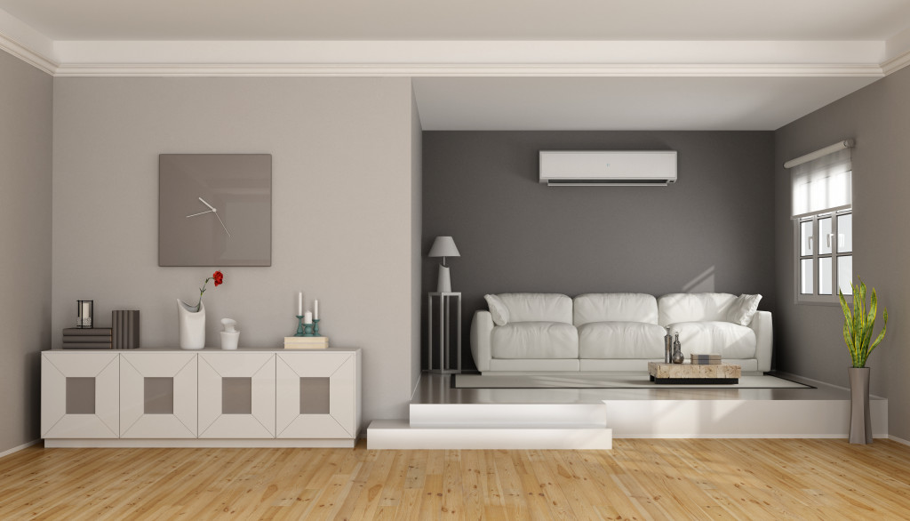
For years, the world of interior design has leaned towards minimalist home decor and Scandinavian-inspired aesthetics. From neutral color palettes to crisp, clean lines, home designers have lived on the mantra, “less is more,” to preserve spaces and evoke a sense of simplicity. Even general contractors are responding to this trend by applying asymmetry and low maintenance finishes for minimalist structures.
While minimalist designs offer a refreshing, uncluttered, and elegant structure, it’s high time for homeowners to explore other design concepts. This is where kindercore comes in, an interior design trend known for its carefree and vibrant themes. Geometrical shapes, bright hues, and child-like pieces are the basic elements of this happy-go-lucky design movement. It brings all the fun in your living spaces, injecting personality, creativity, and vibrancy right into your home.
With its simple, youthful pieces, kindercore is for those who want to add a pop of color and fun in their spaces without going all out. It’s a response to life’s daily stressors and a reflection of our collective desire to move towards an inclusive and compassionate direction. If you’re ready for something fun and quirky, here’s a brief discussion about kindercore, its history, and ways to incorporate it in your home.
What is kindercore?
Many people confuse kindercore with minimalism because of its emphasis on simplicity. In reality, kindercore offers a new kind of simplicity that emanates a fun, happy-go-lucky spirit, which gives off an exciting twist to minimalisms’ monochromatic interiors. The main principle of this design movement is going all-in on elements that minimalism used to hold back. It centers on primary colors and pieces that look and feel carefree, vibrant, and almost childlike, hence its name.
If minimalism is all about tranquil, relaxing, and slightly colorless spaces, kindercore introduces personality and creativity in your home. In a world bombarded with terrible happenings and bad news, designers set the balance by incorporating bright aesthetics to lighten our moods. This is perfect for anyone fed up with sterile environments and prescriptive design trends and is ready to go all out with bright colors and geometric designs.
Kindercore is a perfect combination of something vintage and modern with a dash of personality. While its main principle revolves around integrating bold and simple colors, more designers try out solid, bold hues, such as neon green and fire-engine red.
How did it start?

Kindercore took its roots from the German word kinder, meaning “children,” because of its almost childlike elements. This may be the first time you’ve heard of kindercore, but this design movement has been around since 2010. It’s heavily inspired by the style hints of 20th-century Dutch painter Piet Mondrian and Dutch architect and furniture designer Gerrit Rietveld.
This design idea shares the most similarities with the iconic Memphis design movement from the 1980s, an Italian design and architecture group that rebelled against minimalism and functional modern style by turning to radical and innovative designs. It is characterized as innovative, humorous, and quirky, combining traditional techniques and existing materials to create unique forms.
Although kinder core’s staple elements aren’t entirely new, the use of childlike designs and primary colors offers a welcomed and stark contrast with minimalism’s simplistic and monochromatic approaches that have taken over the previous decades.
Basic principles of kindercore
A great way to start is to discuss the most popular feature of kindercore — colors. The most widely used colors for kindercore are primary colors. But before you start painting the entire house with bright hues, keep in mind that kindercore is not about making your house look like a rainbow. The extent of its features entirely depends on you by choosing colors that will give your house a vibrant and comfortable backdrop. A great tip is to start on areas or pieces with neutral features and invest in statement pieces that will lighten the mood of the interior.
Chubby furniture is another key feature of kindercore. Balloon-shaped elements, swooped-backed sofas, and low round poufs are the main driving force of kindercore furniture. It’s all about ditching the clean, straight, and seamless lines we’ve been so familiar with mid-century furniture pieces. Thick sides and curved lines are its staple features that look juvenile enough to fit an adult living space.
It’s always fascinating how we tend to look back on what made us happy during our childhood. Kindercore makes this possible by driving a positive response for our interiors. If we’re going to make our home look inviting and cozy, we might as well make it look fun, carefree, and childlike. At the end of the day, nothing feels better coming home to a house that will fill our spirits instantly.


